

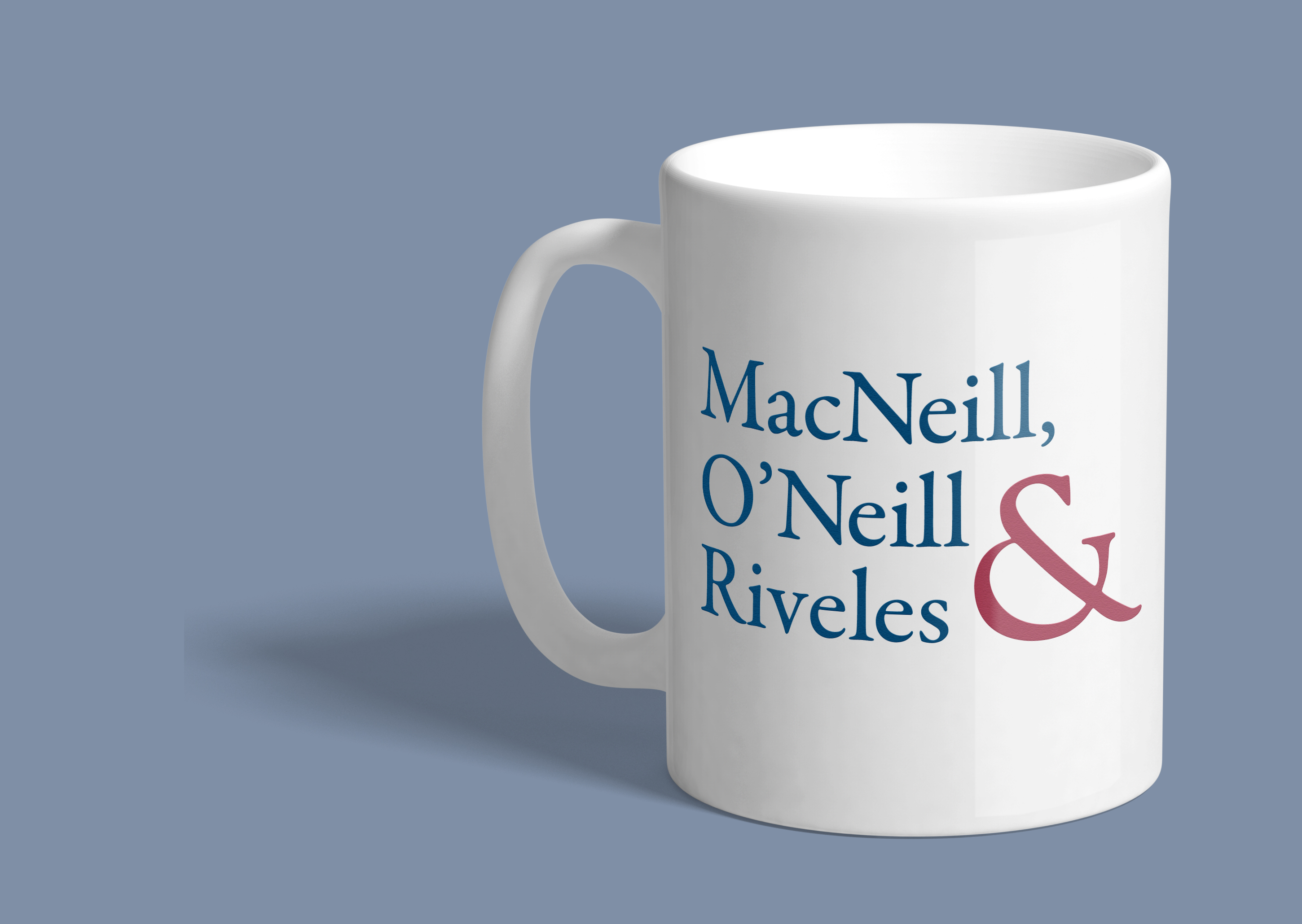
Creating a type-only logo can be challenging. The type must express the essence of the brand, in this case, confident professionalism, while looking fresh and distinctive. While sampling various classic, serif typefaces for the new law firm MacNeill, O’Neill & Riveles, LLC, the differently-designed ampersands for each typeface caught my eye. I was drawn to this open, friendly ampersand, and decided that it should be the focus of the logo, visually suggesting accessibility and collaboration, both among the attorneys and between attorneys and their clients. I made the ampersand red, to attract attention and complement the blue type, and exaggerated its size in the “stacked” layout of the logo, shown above on a coffee mug. The long version of the logo includes the ampersand at the same scale as the other characters, in a more traditional layout, suitable for letterhead and other everyday uses.
I also designed a website for this law firm that uses the red ampersand as a distinctive motif.