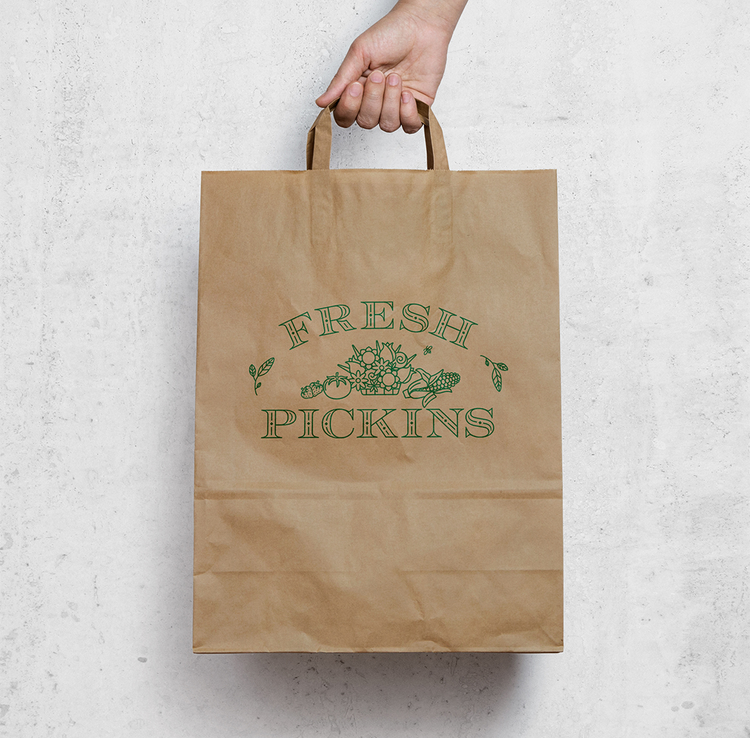
Having grown up across the street from a farm in Pennsylvania, designing a logo for a beloved farm market in rural New Jersey felt like a sort of homecoming. The new owners of this Sussex County staple for farm-fresh produce, seasonal flowers, artisanal foods, and curated antiques wanted a clean yet traditional-looking logo that displayed a tempting sampling of the market’s offerings. I found a vintage-inspired decorative font for the market name and arranged it in an arch that could accommodate my still-life illustration of produce and flowers. The owners suggested adding a bee buzzing around the border, which adds to the country vibe.
Fresh Pickins logo in full color
We wrapped up the project in chilly February, so it was a wonderful surprise to unexpectedly spot the logo on a billboard in June, en route to my daughter’s sleepaway camp. (Sometimes having no natural sense of direction and geography is a gift!)