Lore Management is a family business involving four siblings. They wanted a clean, modern logo to represent this core four as individuals with a family bond, while at the same time communicating the focused and strategic nature of their business venture.
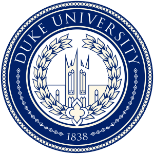
We started the design research by looking closely at what three of four siblings held dear — their alma mater, Duke University. We also examined Syracuse University symbolism to include the Orange sibling. We found that both schools incorporate wreaths into their official emblems as traditional symbols of academic achievement. The wreath also symbolizes athletic victory, which was additionally meaningful to the sports-loving siblings. Lastly, we couldn’t ignore that “laurel” (a leaf frequently found in wreaths) simply sounds like “Lore;” although the two words don’t seem to be etymologically related, the latter, meaning a body of learning or knowledge, echoes the academic symbolism of the former.
Syracuse University Seal
Duke University Emblem
Duke University Seal
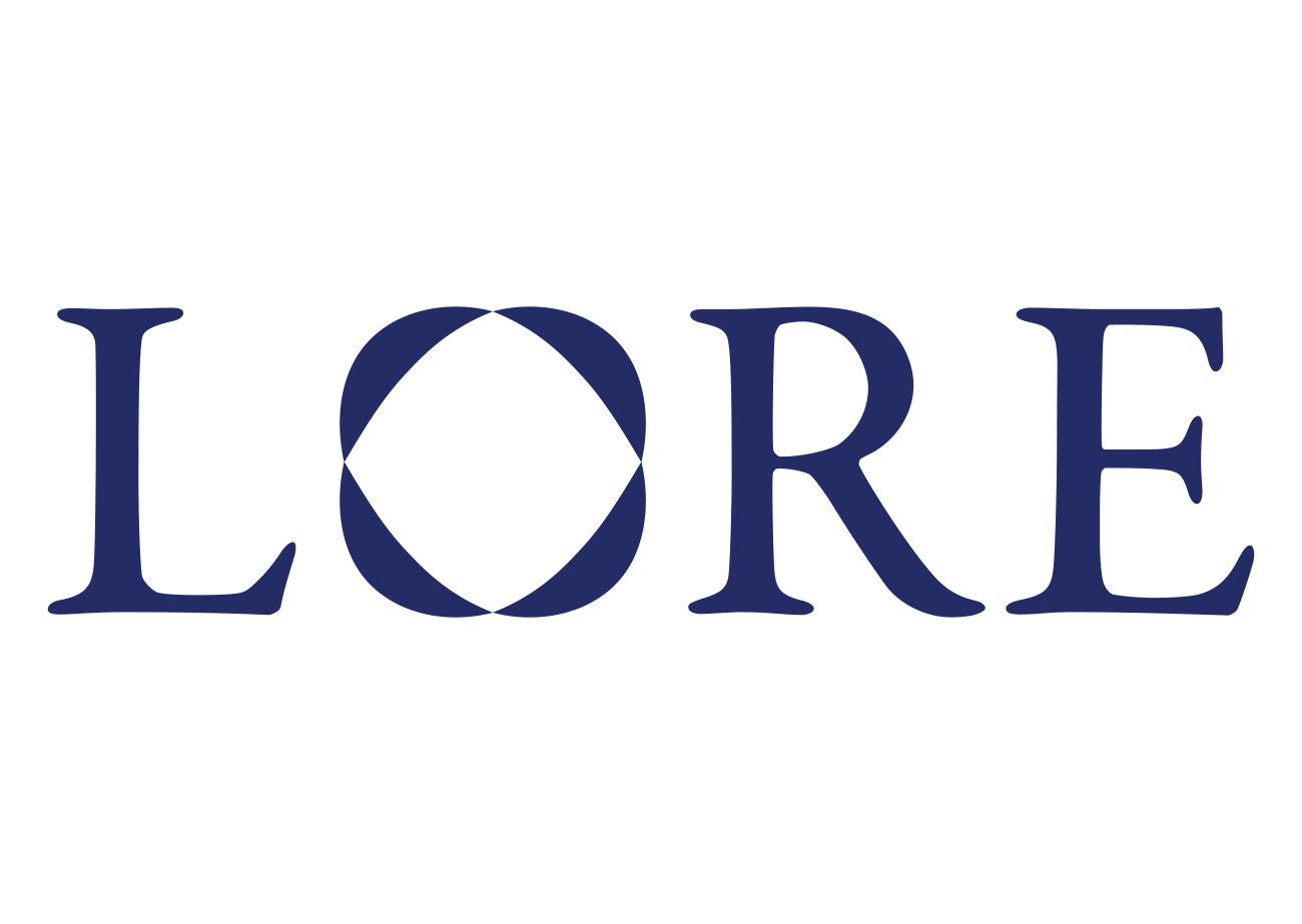
Inspired by the shared symbolism and meaning of Syracuse and Duke’s seals, we decided to incorporate a wreath into the logo. This wreath would comprise four leaves, one for each of the siblings. It was challenging to create a wreath with only four leaves, but we went through several rounds of increasing adjustment and abstraction to get there. Along the way, we realized the wreath’s ring shape would make an effective stand-in for the letter O in Lore.
In further tribute to Duke and Syracuse, we used Duke navy blue for the logo color (Syracuse has a close shade of blue in its official palette, too).
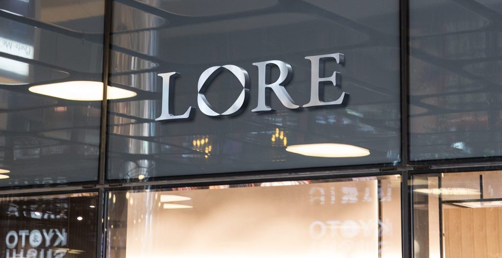
As a part of the logo design process, we mocked up the Lore logo as office signage, and were thrilled with how sleek and professional it looks. As the business grows, I’m excited to see the logo in real-life use.