


Customizing a Substack newsletter/website can be confusing, with different roles, design specs, and dispersed controls for each visual element. I learned this the hard way while making a GenX pop culture Substack, Daughters of the Dial (DoD). Through trial and error, I managed to create a distinctive, cohesive look and would be happy to help you make your Substack stand out (minus the frustration) with an original welcome screen, logo, wordmark, email banner and more.
Welcome Screen
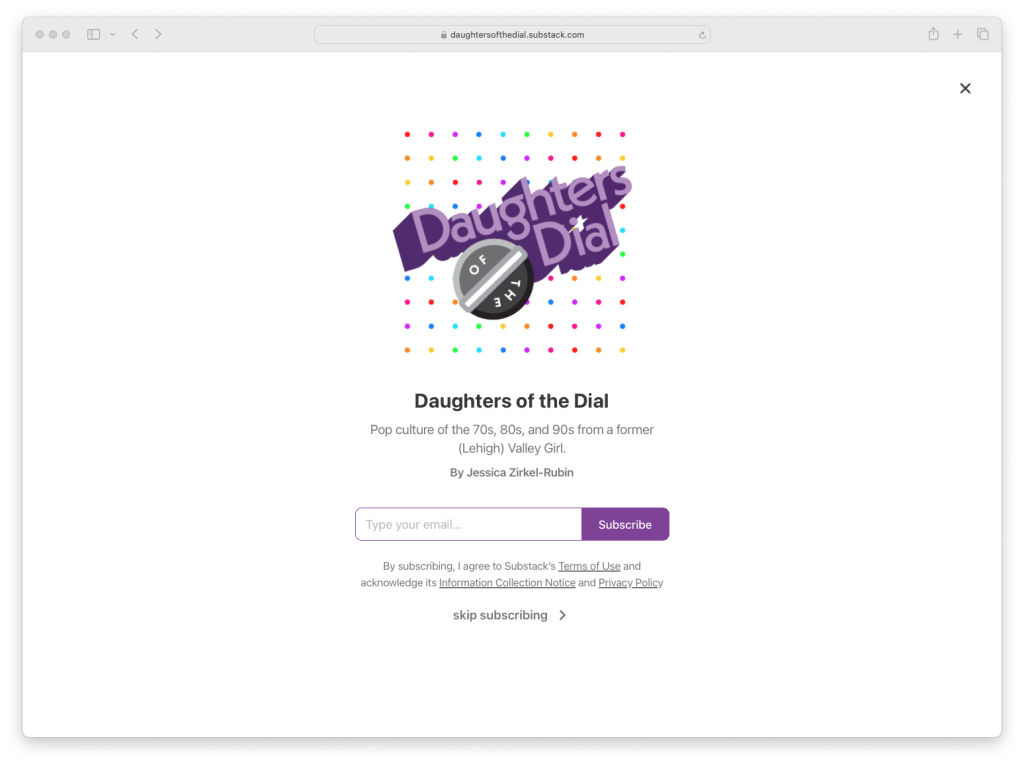
A potential subscriber’s first impression of a Substack is its welcome screen. Substack currently allows only one image here with minimal copy, so creating an eye-catching, welcoming look that broadcasts the vibe and/or contents of the newsletter is key. Without a budget for professional photos or even good stock photography, and with the idea of introducing the DoD brand, the logo and wordmark take center stage in dynamic, drop-shadow style reminiscent of a 70’s-80’s TV show title. The dot grid in the background is an expansion of the logo and looks something like a Lite Brite – another subliminally snuggly 70’s childhood reference.
Logo & Wordmark
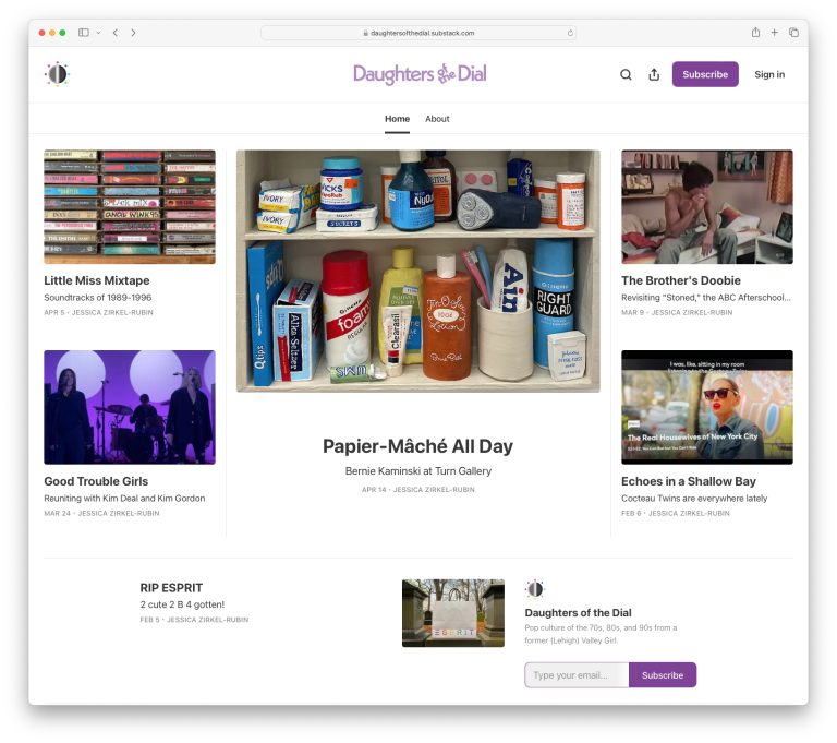
The logo and wordmark appear in several spots across one’s Substack website homepage, email newsletter, and app. For example, in the homepage layout below, the logo appears twice (upper left corner and the lower right), while the wordmark is shown once (upper middle). Substack doesn’t provide many options or controls for how or where these elements are shown, so it’s important to be design them flexibly and strategically. Read more about the DoD logo and wordmark here.
Email Banner Image
Another visual branding opportunity is the email banner image, which appears atop every post or message sent to newsletter subscribers. Substack allots this image relatively more screen space than other visual elements, so take advantage of this prominence! In this case, I have combined the DoD logo and wordmark – a cute combo that would be redundant on the homepage.

More Visual Elements
Although Substack so far doesn’t explicitly require any other branded elements, opportunities exist to feature a custom color, photo treatments/frames, borders, section headings, and more. As DoD grows, I’ll probably explore these options. Stay tuned!