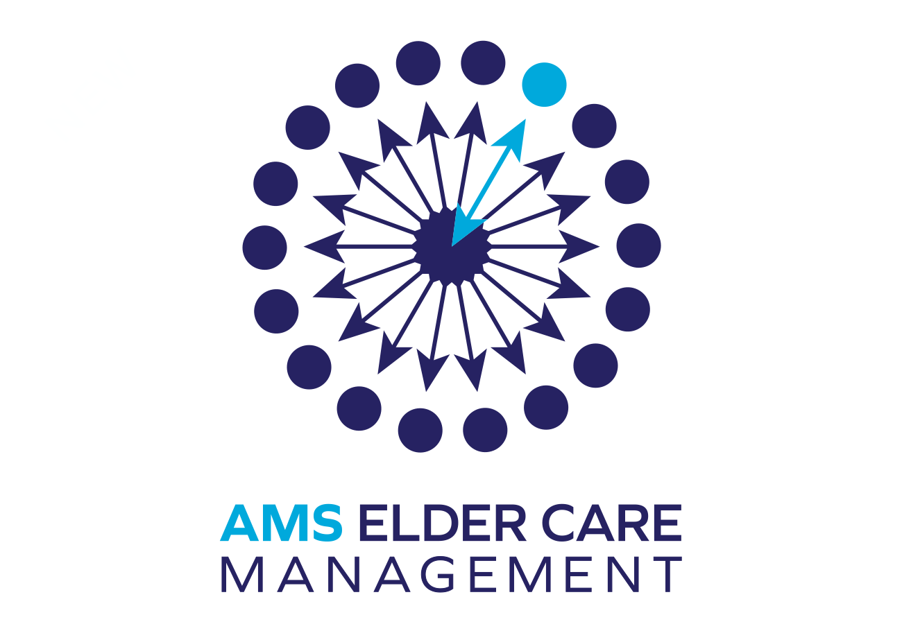
This client sought a clean, bold, and confident logo for her new business, a nurse-owned and operated elder care management company. It was challenging to design a symbol that captures the myriad decisions involved in elder care planning, but lots of sketching and experimentation led to a great glyph. The arrows lend a feeling of motion and activity, while the overall symmetrical, almost floral, array provides balance and calm. The color-contrasting arrow and dot indicates a choice made among many, and momentum from point A to B. Last (but not least), the uncluttered, sans-serif font in varying weights and colors facilitates reading of a long-ish business name.
As with most logo projects, I provided the client with two layouts for various uses; in this case, a long horizontal for website titling, letterhead, etc., and a more vertical version (shown above) for social media posts, profile pictures, and similar spaces.
horizontal layout of AMS Elder Care Management logo