When the Covid-19 pandemic forced the long-thriving Fringe Salon to pause, its owner embraced the opportunity to re-imagine her small business. She teamed up with three other principal stylists to create an equal partnership, envisioning a space that would foster camaraderie, community, and creativity — a “collaborative.”
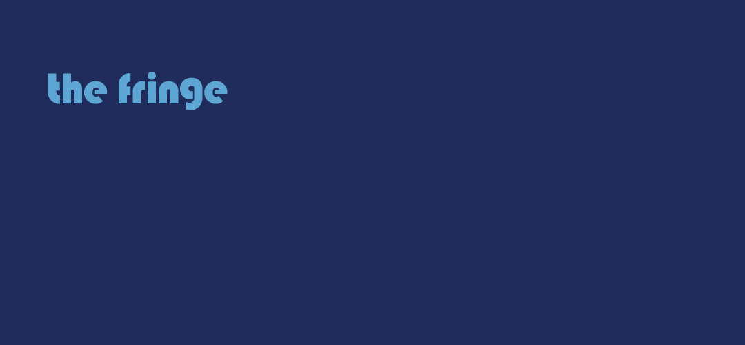
This new logo honors the salon’s legacy while communicating the shared values and optimistic energy of the new organization. For continuity, it retains the original business name and the navy blue of the previous logo, but incorporates a different font, graphic elements, and expanded palette. The logo is inspired by the bold lines and fluid curves of 1970’s geometric murals (“supergraphics”); the font arose during the same era (Bauhaus, created in 1975) . The medium blue and coral stripes not only bend to form the double L’s of “collaborative,” but also evoke the intertwining of the talents and personalities of the partner stylists and loyal clientele. These stripes can be extended beyond the salon name in both directions, suggesting movement and continuity and providing further creative branding opportunities such as animation. Finally, the cheerful, multicolor letters symbolize inclusivity, as The Fringe Collaborative strives to create an environment of non-judgment and acceptance.
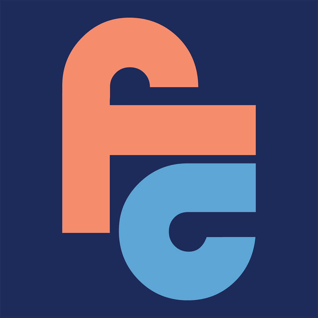
In addition to the logo, I created a complementary icon for use in smaller spaces, such as social media profile photos and the website favicon. It’s a stylized monogram, using the same font and predominant colors. The cross stroke of the F and the top arm of the C are extended to mimic the stripes of the full logo. The initials are nestled close together, in another subtle nod to collaboration and camaraderie.
It is always a dream to work with longtime client Kim Hammer and her talented team; we share a pop-culture perspective that feeds our far-out brainstorming sessions and leads to fun, fulfilling projects such as this one. Long live The Fringe Collaborative!