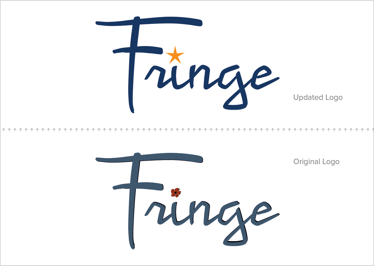
In celebration of its 10-year anniversary, The Fringe Salon got a makeover. Embracing its “punk lite” culture and diverse clientele, we sought to update the salon’s logo without losing its brand continuity. While retaining the original, custom calligraphic typeface, we swapped the somewhat feminine cherry blossom dotting the i for a more universal star, We ditched the drop shadow to keep the lettering sharp, and updated the muted, dusty blue and brick red of the past with a richer navy and brighter orange, for greater contrast and pop.
With a few seemingly simple changes, the Fringe Salon logo has become more rock-n-roll — bolder, more inclusive, and flexible for a variety of applications. For example, we recently leveraged the sometimes-naughty association of the star symbol in the salon’s roller derby sponsorship banner.
roller-derby-ready tagline reads "Hair That Kicks A★★"
logo as a metal sign, mounted on the brick wall behind the reception desk
The new logo also looks great in a single-color application, for instance, rendered in metal for salon signage.